Brief
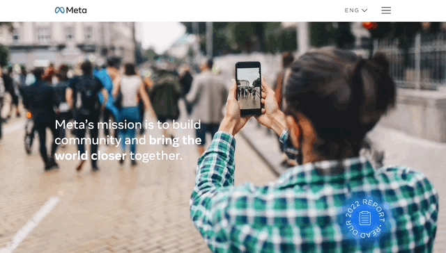
Meta asked my team to create a coherent and impactful website to showcase what Meta has been doing to meet its human rights obligations globally. It’s going to be the go-to source for anyone who actually wants to understand how Meta interacts with the global human rights system and supports rights on the ground for users. The main goals for the site is to host their human rights policy, human rights annual report, and then to provide links to current sustainability and newsroom information relevant to human rights at Meta.
My role was to drive the UX Design of the site, create a design system which is compatible with their parent branding, and work with another designer and the development team to bring the overall site to launch.
Challenges
My 2 biggest design challenges were:
- Creating a design system that is distinctly different from their corporate branding, but still sits within the Meta ecosystem.
- Designing animated text elements that are easy to update, and can be translated into many different languages.
One of the sticky points for this project was determining when and where to break branding. Originally, we thought that breaking grids, and typography, would be an impactful place to start straying from Meta’s sans serif, and potentially look at adding in other color options beyond blue and gray. However, ultimately we decided that interactive elements such as CTA’s and hover states would be more impactful, and that keeping the other standard elements in place would maintain a more trusting and serious tone.
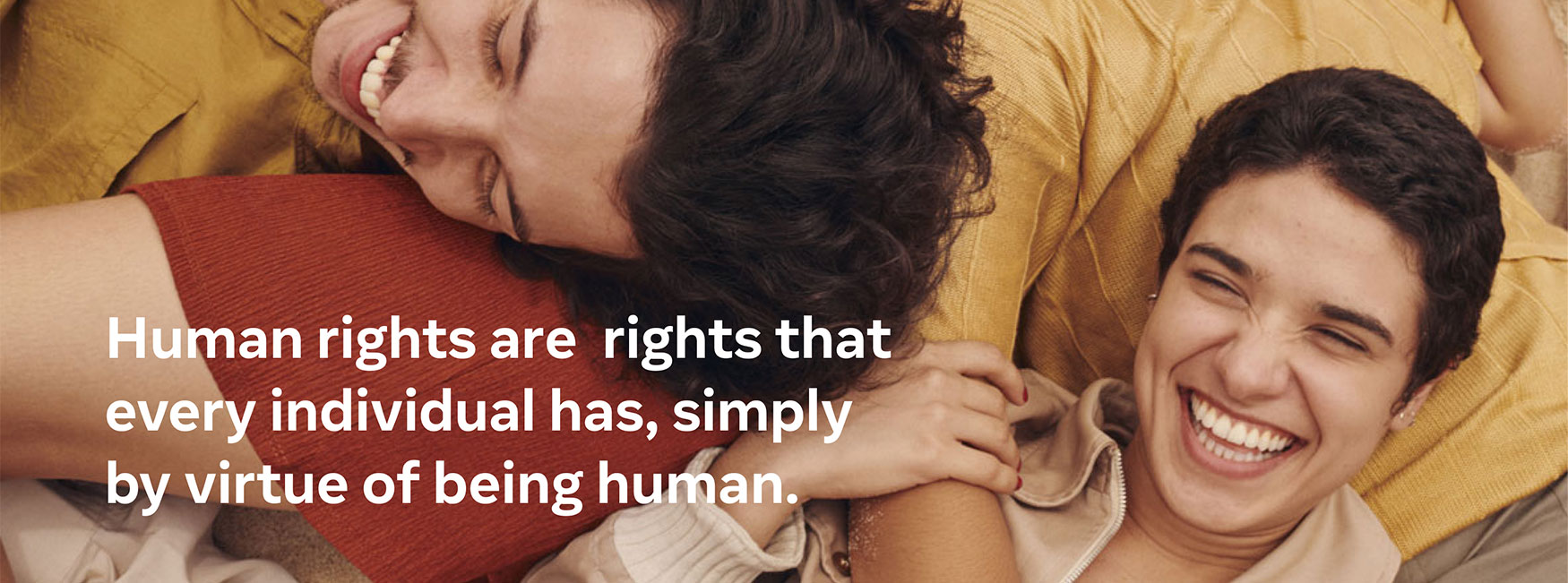
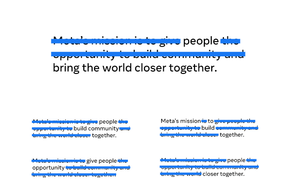
My team came up with a moodboards for animation treatments that build off of visual metaphors such as redacted text, and the blurring and ‘unblurring’ of words. This was an excellent talking point to get us on the same page as far as artistic direction. However, the more we dug into the execution of these ideas, the more we realized the complexities of coding these styles. (For example, in Arabic text must animate from right to left. Also, in some cultures, there is a deep stigma in showing text on faces.)
Design Solutions
Some solutions for the above include:
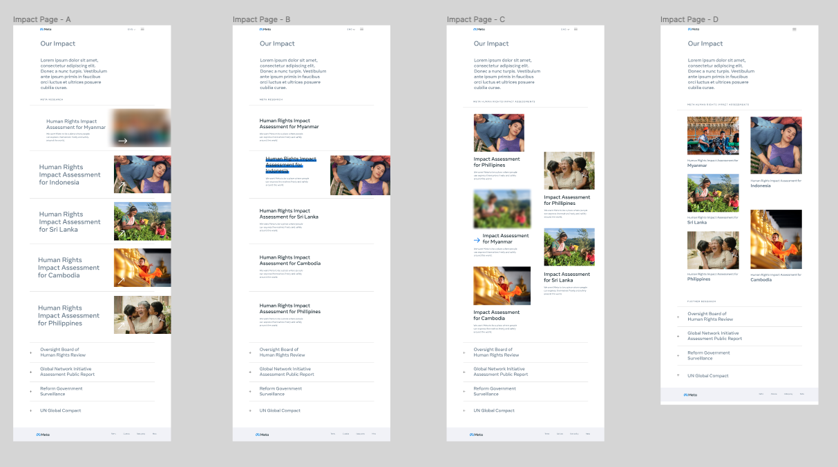
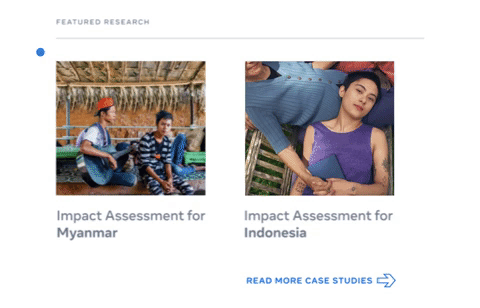
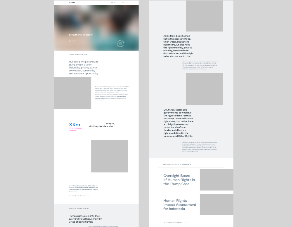
- Offering side-by-side layout options that display the content in different ways. This was an excellent way to segment out decisions, and which direction we might go with in order to push the reveal/conceal concept even further.
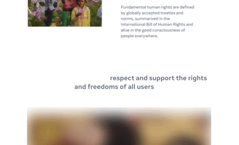
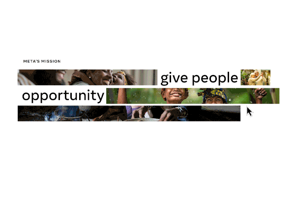
- Narrowing in on a ‘blur on load’ image treatment, to carry out the metaphor of the site. This conveys a feeling of seeing through a lens or scope on the content.
- Pushing the design of interaction on the CTA’s on the website. By using a gradient blur on the cursor, the user can further interact with clickable elements on the site. This way we can keep in line with Meta’s overall branding, yet give a distinct experience to this microsite.