Brief
I designed a collection of screens for an app with a team of two other UX researchers for Leaders of a Beautiful Struggle, a “grassroots think-tank which advances the public policy interest of Black people in Baltimore”. They wanted to create a platform that would connect volunteers, solicit donations, and easily share news among supporters.
My goals:
- To target Millennials and older Gen Z demographics.
- Engage the donor base by leveraging BJ Fogg’s behavior model to introduce gamification and incentivize micro-donations.
- Introduce a scaled-back social media platform structure to add friends, view and attend events.
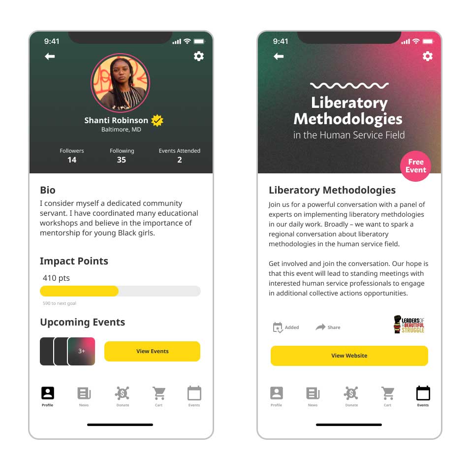
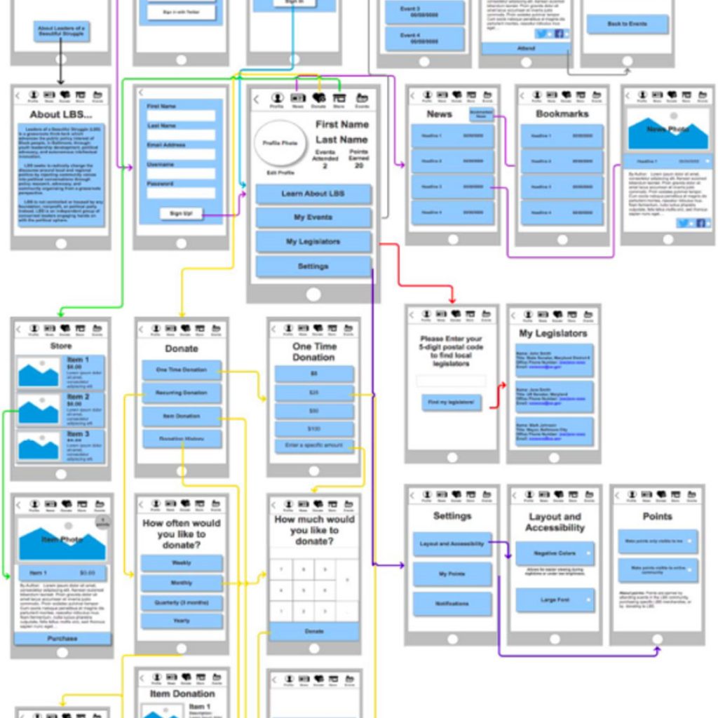
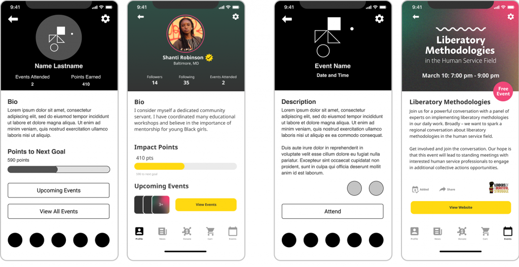
I designed a total of 28 wireframed screens, with two finalized screens below displaying the profile screen and an example event page.
The roles I assumed during the process of design: User Researcher (on a team of 3), Data Analyst (on a team of 3), UI/UX Designer, and Product Designer
User Research Summary
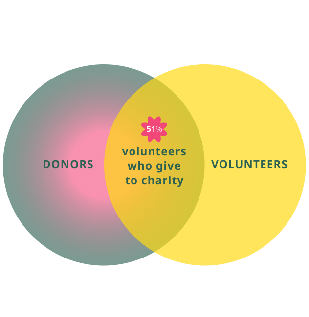
There are many ways in which organizations like LBS can incentivize their target audience of Millennial donors, by focusing on examples used to promote microphilanthropy behavior in mobile apps. It’s important to provide options for monthly giving in online campaigns, and donors who give regular gifts do so because they had “access to information that proved the impact of their contributions”. Additionally, volunteers are twice as likely to donate to an organization.
Further, by integrating gamification of ‘points’ on the profile screen, the user can immediately see their impact and track their goals for event participation and donating.
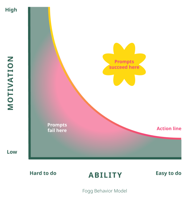
While a donor may have the altruistic motivation and economic resources to give, people also need triggers to facilitate a behavior to be actionable.
According to BJ Fogg, there are three major components for understanding human behavior: motivation, ability (to perform the behavior), and triggers. Alerts on an app, social media notifications, or emails can be impactful persuasions that provide the external influence which many donors need.
Visual organization was a huge focus as well, along with design consistency and reducing clutter, with consideration for reducing the risk of content overload.
User Testing
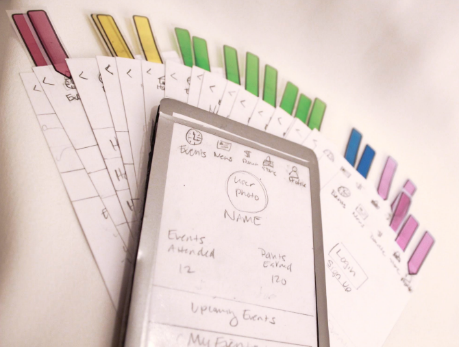
For the first phase of the design process, it was important to begin with making a paper prototype of the app. The prototype would have features that fit the needs of the users and showcase all that LBS has to offer.
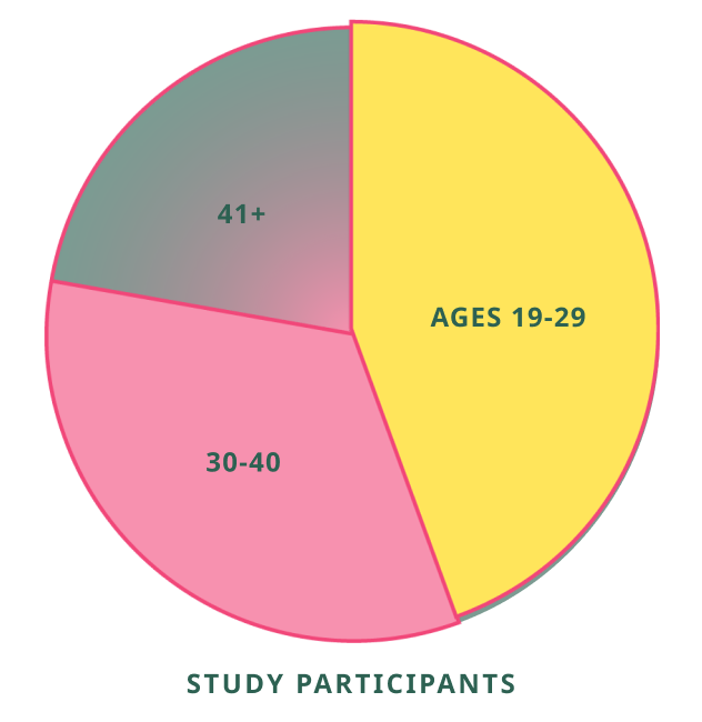
Because LBS’s target audience is largely focused on individuals in their 20’s to early 30’s, we approached people walking through the University of Baltimore’s student center to participate in a user study research using paper prototyping methods.
We asked our participants to provide us with background information about their age, job, and whether they donate or volunteer regularly. Almost all participants said that they are active in nonprofits in some way, most donating in amounts less than $30 at a time.
Then, we asked them to walk us through how they would approach various tasks and watching in real time how they responded, struggled, or succeeded. Only one of our participants was already familiar with the mission of Leaders of a Beautiful Struggle. Yet all of them were willing to suspend their disbelief in using the prototypes like a real phone. And even commenting about looking for free food on an event page!
By having screens designed in pencil, we were able to make quick edits and revisions in time for the next participant. At times, we changed the script order so that we could ensure that the user wasn’t readily “primed” for other tasks. That way, we could make sure that the task flows made sense from different endpoints and flow directions.
Digital Prototyping and Results
Next, we gathered more users to test the prototype on their computers, while a researcher watched and made notes on the difficulty of each task. The User Task Scenarios were as follows:
- Imagine you are joining for the first time. Walk me through the sign up process.
- Let’s say you want to buy a t-shirt from the store. But you aren’t a member, so you sign in through your Goggle account first.
- Show me how you would set up a donation for $25 every month. Walk me through the donation process.
- Imagine you want to look at upcoming events.
- Show me how you would check out the post recent news stories.
- Let’s say you want to view your donation history. Show me where you would find this info.
How would you change the font size of the app?
A couple of problems we encountered was:
- Almost every participant had difficulty or could not locate the donation history, which proved that it needed to be moved away from the Profile page.
- Settings was expected to be a gear icon in the upper right hand side.
- Our testers expressed that they wanted more settings options, and more nuanced options to integrate with social media.
- Evolved the Impact points to a tracker that levels up, inspired by crowd-funding sites.
- Streamlined the interface design, and favoring other layout options over cluttered buttons (for example the Upcoming Event sections.)
- Flipping the icons to the bottom section for easier thumb access.
The designs below show how screen interfaces were adjusted based on the feedback given.
Final Designs and Next Steps
A few additional changes, and where I’d want to test next:
- Exploring the layout on the Full Calendar and News pages with more focused detail, and testing to consider removing the ‘Shop’ page.
- A verification system implemented to help protect the safety of the LBS social justice community from trolls, and worst case scenario, doxxing.
- Follow the analytics once the product is launched to see where donation improvements can be made, or even try A/B beta testing to track engagement and donation outcomes.